REV Delivery
Your favorite snacks at your doorstep in 10 minutes
Context
January 2024, I led product design at REV Delivery — creating a new and improved mobile application based on their original Shopify storefront. I owned the transition from website to personal mobile app.
Preview

Original site
Redesign
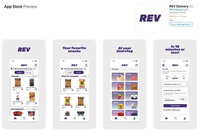
Shipped to App Store
Original site
Original site

Original site
Redesign
Shipped to App Store
Meet the team

Overview
REV Delivery started in Seattle in 2023 with a simple idea: bring snacks to college students, fast. Three UCSB grads were tired of late-night food runs, so they created a delivery service that promised snacks in just 10 minutes. They began as three drivers (on electric scooters) serving the University District and a basic menu of dorm room favorites.
When I joined as their first designer, REV was using a basic ordering system that was struggling to keep up as more students discovered the service. I worked closely with the founders and two developers to rebuild the ordering experience from the ground up. We focused on making it easy to browse, order, and track deliveries.
Problem
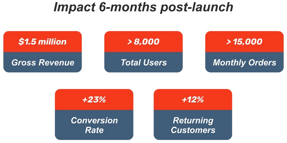
Despite REV's popular concept, their website was letting them down in a big way. During their first 6 months in Seattle's U District, out of 80,000 visitors who visited the site, only 21,000 completed an order - meaning nearly 75% of potential customers walked away empty-handed.
Our analytics revealed the breaking points: a confusing navigation system that buried popular items, a checkout process with too many steps, and a mobile experience that felt like an afterthought despite most users ordering from their phones.
Mobile App Design + Research
Mobile App Design + Research
Mobile App Design + Research
How might we transform the ordering experience to make it faster and more intuitive for busy customers?
How might we transform the ordering experience to make it faster and more intuitive for busy customers?
How might we transform the ordering experience to make it faster and more intuitive for busy customers?
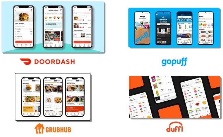
Competitive Analysis
I studied the big players our users already used: DoorDash, GoPuff, GrubHub, and Duffl. I compared everything from their user flows to pricing and interface designs. Duffl particularly stood out as they deliver snacks to college students in 10 minutes using electric scooters and data to stock high-demand products
Beyond just studying the apps, I talked directly with REV users about their experiences. Students shared what frustrated them about our platform and what features they wished we had.
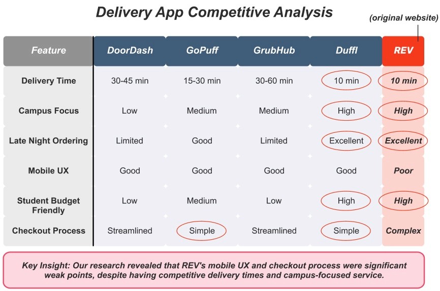
This research revealed our biggest opportunity: while these major platforms had established delivery systems, none had fully optimized for the unique campus environment. I organized these insights into a feature comparison chart that helped our team see exactly where REV could carve out its competitive edge.
User Research + Design Goals
I conducted interviews with 10 current REV users and 5 students who matched our target demographic but hadn't tried the service yet. These conversations revealed frustrations that numbers alone couldn't tell us – students abandoning orders when they couldn't find a specific snack, confusion about delivery fees appearing at checkout, and uncertainty about whether items were actually in stock.
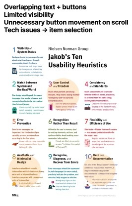
With these insights, I performed a detailed heuristic evaluation of the existing website, identifying usability issues across the entire user journey. The pain points became clear: new users struggled with account creation, navigation buried popular categories, and the checkout flow included unnecessary steps that caused users to drop off.
Most concerning was the mobile experience – despite 83% of our orders coming from phones, the site wasn't optimized for smaller screens.
Original Mobile Website
Original Mobile Website
Overlapping text + buttons
Limited visibility
Unnecessary button movement on scroll
Tech issues → item selection
Original Mobile Website
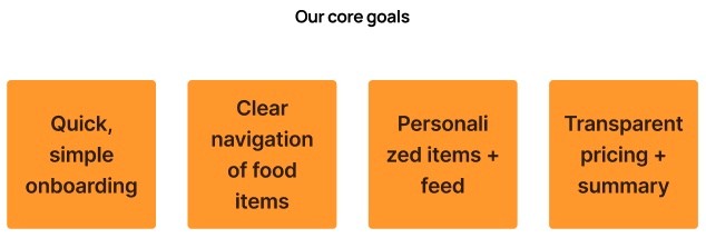
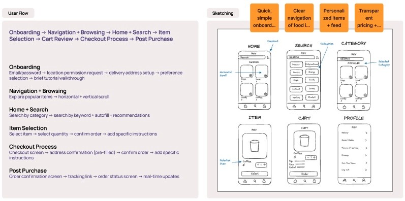
From all this research, we landed on four clear design goals for the mobile redesign:
Competitive Analysis
I studied the big players our users already used: DoorDash, GoPuff, GrubHub, and Duffl. I compared everything from their user flows to pricing and interface designs. Duffl particularly stood out as they deliver snacks to college students in 10 minutes using electric scooters and data to stock high-demand products
Beyond just studying the apps, I talked directly with REV users about their experiences. Students shared what frustrated them about our platform and what features they wished we had.
This research revealed our biggest opportunity: while these major platforms had established delivery systems, none had fully optimized for the unique campus environment. I organized these insights into a feature comparison chart that helped our team see exactly where REV could carve out its competitive edge.
User Research + Design Goals
I conducted interviews with 10 current REV users and 5 students who matched our target demographic but hadn't tried the service yet. These conversations revealed frustrations that numbers alone couldn't tell us – students abandoning orders when they couldn't find a specific snack, confusion about delivery fees appearing at checkout, and uncertainty about whether items were actually in stock.
With these insights, I performed a detailed heuristic evaluation of the existing website, identifying usability issues across the entire user journey. The pain points became clear: new users struggled with account creation, navigation buried popular categories, and the checkout flow included unnecessary steps that caused users to drop off.
Most concerning was the mobile experience – despite 83% of our orders coming from phones, the site wasn't optimized for smaller screens.
Problem
Despite REV's popular concept, their website was letting them down in a big way. During their first 6 months in Seattle's U District, out of 80,000 visitors who visited the site, only 21,000 completed an order - meaning nearly 75% of potential customers walked away empty-handed.
Our analytics revealed the breaking points: a confusing navigation system that buried popular items, a checkout process with too many steps, and a mobile experience that felt like an afterthought despite most users ordering from their phones.
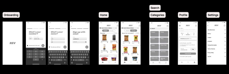
Onboarding
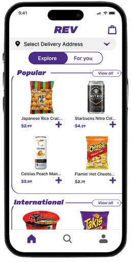
Home
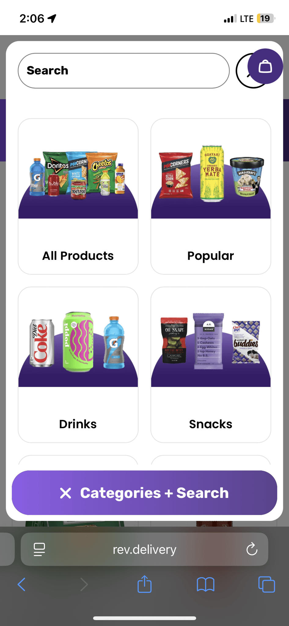
Search + Categories
Search + Categories
Profile